Every email marketing campaign has its own unique purpose, but the goal is ultimately to convince your subscriber to convert (your desired end result). Whether the goal of your email is to encourage people to make a purchase, download an asset, or read a full article, it’s important to know the specific (and final) action you want subscribers to take. With that laser focus, you’re armed to design great emails that capture attention and convince subscribers to convert.
Read on for seven tips you can apply to your emails from Litmus Email Marketing Director Jaina Mistry on how to do exactly that. (Want to learn more of her insights on optimizing your emails for conversion? Check out this Constant Contact on-demand webinar.)
1. Identify a primary goal for your email
When you understand what you’re trying to accomplish, creating every other element of your email will be much easier—from writing the headline, to finding the right email imagery that works for your audience, to honing in on that perfect call to action (CTA) that will drive conversions.
2. Use a highly recognizable sender name
Your sender name has the biggest impact on whether your emails are opened. Much like you may not be willing to take a call from an unknown number, subscribers are more likely to notice your email when they recognize the brand it’s from.
If you do want to use a person’s name to make your organization’s message feel more informal and approachable, make sure you maintain your brand name’s presence so your “From” name is clear to your subscriber. For example, at Litmus, we use a framework like “[Employee Name] at Litmus” for those email campaigns that warrant a more personal touch.
![at Litmus, we use a framework like “[Employee Name] at Litmus” for those email campaigns that warrant a more personal touch.](https://www.litmus.com/wp-content/uploads/2022/10/Screen-Shot-2022-10-17-at-5.01.06-PM-300x58.png)
3. Make your subject line and preview text work together
Think of your subject line and preview text as partners in crime. For example, you can ask a question in the subject line and answer it (or tease the answer) in the preview text.
Don’t shy away from using offers or even words like “free” when it’s true and appropriate to drive action. That old email marketing axiom that there are certain words that automatically send your emails to spam just doesn’t apply anymore. (And of course, you can and should conduct email testing before you send to spot and correct the red flags that indicate it could.)
4. Choose a layout flow that makes people want to read
Following email design best practices can ensure you’re creating a visually appealing, scannable, and accessible email.
When the goal of your email is to convert (drive action), three email design options can be especially powerful.
Email design #1: Inverted pyramid
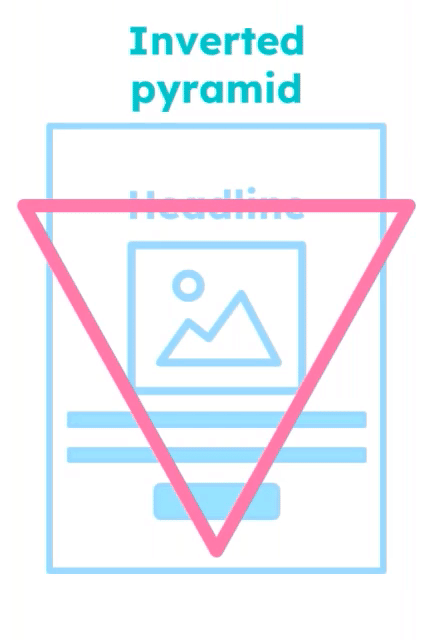
The inverted pyramid structure is great for emails that promote a CTA. The design inherently lends itself to guiding the subscribers eyes down to where you want them to take that clear action.
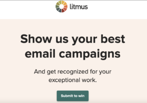
At Litmus, we rely heavily on this email design for the emails we use to promote Litmus thought leadership resources—like a webinar or a guide. The clean design is simple and effective, with what is ultimately a long headline, an image, and a couple of lines of copy.
The example below shows how we use the inverted pyramid to focus attention on the headline, subhead, and CTA button at the top of the email, using elements of the Z-pattern technique.
Email design #2: Z-pattern
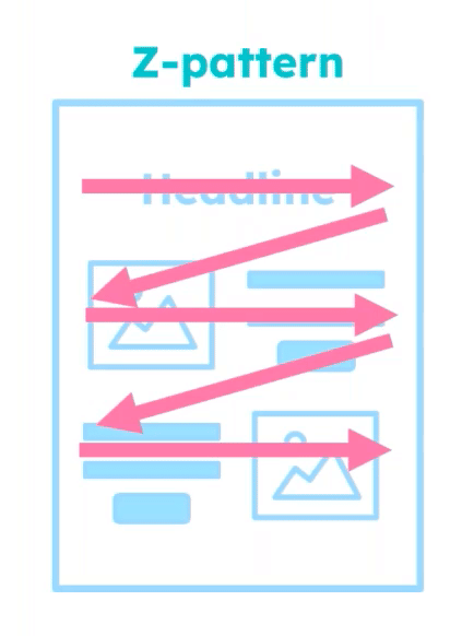
The Z-pattern email design is great for things like email newsletters—or any email where you really want the reader to stay engaged. The pattern of the content directs the reader’s eye to jump from left to right. Incorporating images breaks up the content a bit to keep them reading.
Email design #3: F-pattern
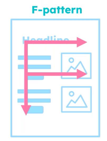
The F-pattern email design is similar to the Z-pattern, but because copy and content is left-aligned, it can be easier to read for some. Keep this in mind based on your subscriber audience.
This example from our Litmus Weekly newsletter uses the F-pattern.
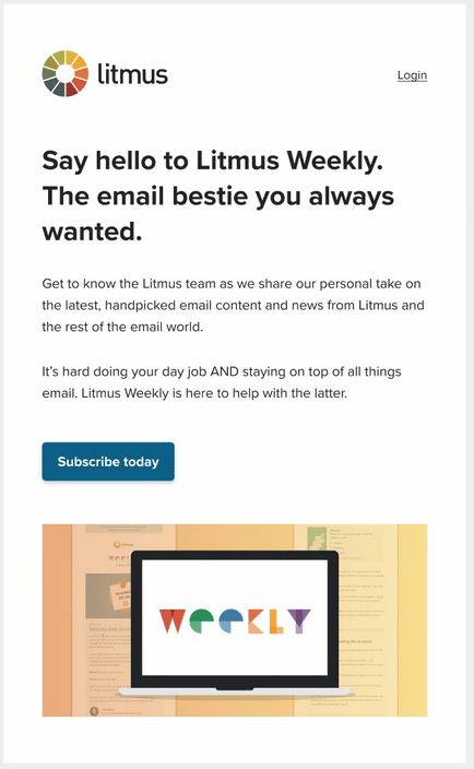
Regardless of the email design you choose, remember that images will look different based on the email client. Conducting thorough email testing and QA before you hit send is key to knowing how your email will truly look in your subscribers inbox.
If the majority of your subscribers use email clients that don’t automatically load images, you still have options.
- Option 1: Use images in your email–but don’t rely on them. Help your audience be able to take action on your email. Think of images as purely decorative.
- Option 2: Lean into plain-text style emails. Run tests on the messaging to find out what copy best resonates with the audience and what drives those conversions.
5. Use headlines to drive simple hierarchy
When you write your headlines, try this trick. Ask yourself how they’d read if someone were to scan the email and only read your headlines.
If your headlines are repetitive, your subscriber might lose interest before they ever reach your CTA. Keep your headline styles consistent throughout your email so it’s visually clear that it’s a headline—even at a glance.
No matter how beautiful your email may be, most won’t spend time actually reading it; people tend to scan emails. Make sure your headline and CTA button text are cohesive and work together.
When you write CTA copy, use action words with context for your CTA buttons. This lets readers know what to expect when they click—and makes it accessible for people who use screen readers. For example, a CTA like “learn more” tells the subscriber nothing about what they’ll really get from the click. But a CTA like “Read the menu” tells them everything!
6. Use imagery
Every single email should have some kind of imagery. It grabs attention and gives a bit of a visual pause for the reader. Depending on your industry, audience and brand, you may want to experiment with elements like animated GIFs and interactive email images.
That said, it’s important to keep your audience (and the GIF you’re considering) in mind so it’s a value—add and not a deterrent to your email. Because GIF animation is very rapid, it can be harmful for folks who have a visual impairment or epilepsy–but rapidly animating GIFs in general can even act as a distraction for those without visual impairment. Consider if the GIF makes the experience better—or distracting—for the subscriber.
Load time is also critically important when you’re using imagery; keep your file sizes small. While not all email clients support animation (we’re looking at you Outlook 2007-2019), many do.
7. Test what works for your audience
There is so much you can (and should!) test to see what works for your unique audience. Try these two A/B testing approaches.
1. Send two versions of your email to a percentage of your audience
There’s no hard and fast rule around what percentage of your audience should be in your “guinea pig” group, but 25% should be fairly representative of your audience.
After a period of time (whether it’s hours, or a few days), the winning version (defined by conversion rate) is sent to the rest of your audience.
2. Split your audience 50/50
One audience receives a “control” and the other receives a “test version.” Monitor your email analytics to see what performs better.
Try testing any of these email elements—just be sure to stick to one variable at time.
Create email campaigns that convert
When you approach email design with an eye towards what you really want subscribers to do with your email, finding the right approach to your subject lines, content, image choices, and design all become easier. Apply these seven tips and test as you go to drive more engagement and conversions in your email campaigns.



More Stories
Biden and Trump: A Look at Their Impeachment Battles
Biden and Trump Under Investigation: What You Need to Know
Latest Biden vs Trump Approval Ratings Revealed